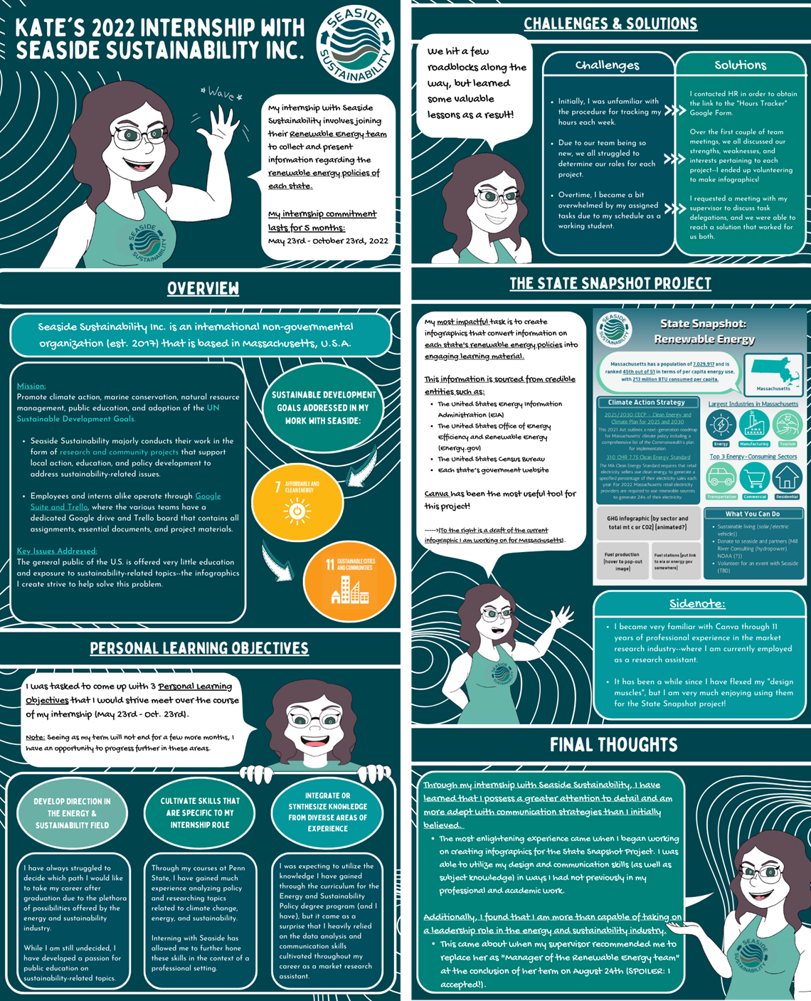
Credit: Kate Robeson-Grubb, Used with permission
Translating the learning and personal growth that comes from various engagement experiences such as internships, exchange programs, research opportunities, and others can be difficult. An infographic is a great way to have students synthesize their experience and share the learning and growth that occurred with the world. It also provides them with an educational artifact they can share on a blog, and even in university poster exhibitions or competitions.
Please read on to see an example of an assignment used for a short-term exchange program.
Assignment Overview
As someone who has completed several different study abroad opportunities, I know there is much to share. An infographic will help you tell that story, but more importantly, it will help you reflect on and synthesize your experience.
An infographic is a way to visually represent your experience in an interesting, and clear, concise way. It should be
- focused - one single message; emphasize its significance to you;
- graphic - graphics and images tell the story (fewer than 800 words total);
- ordered - the sequence should be obvious; simple flow paths and cues should guide the reader.
Consider what story you want to tell
This should include what you learned and how you grew through the experience as well as what you did. Spend significant time thinking about this and sketching out a plan. It is unlikely you will figure this out on your first try. Feel free to send me an outline or sketch. I am more than happy to provide feedback before you start creating the final product.
Choose the Layout
As you can imagine, creating an effective infographic is a bit more complicated than simply putting facts and images together. The information must also be efficiently organized to demonstrate the connections between important concepts or ideas. There are several ways in which you can organize your content. Please watch 10 Types of Infographics and When to Use Them by Easelly on YouTube.
Choose your Software
Now that you know the core elements of infographics, you may be wondering how to actually get started. There are a number of software applications that will help you quickly and easily create an infographic. Many of them also have free tutorials available on YouTube. You can start by looking at the applications listed below. Feel free to experiment and try different ones until you find one that works well for you.
Adobe Express is part of Adobe's Creative Cloud Suite. It allows you to create a variety of graphic-based resources. As a registered Penn State student, you have free access to this software.
Canva also offers free accounts. It has a simple and easy-to-use interface and each item you create is downloadable in a PDF format. *Please note: Canva offers graphics and other elements for an additional fee. You are not expected to purchase anything in order to create your infographics. Doing so is at your own discretion.
Tips for Creating an Effective Infographic
- Present all information in a visual and concise way.
- Cite all data and graphics.
- Choose your fonts carefully.
- Choose a font that is easy to read.
- Limit font choices to 2-3 different fonts and be consistent where you use them (titles, headers, text, etc.).
- Limit the amount of text. Each text box should contain 50 words or less.
- Limit your color scheme to 2-3 colors and use color to:
- connect your ideas, sections, categories, etc;.
- highlight the most important elements;
- direct your audience through the story;
- Consider the size of various elements. Size helps to:
- suggest the importance and relevance of various elements -- the bigger something is the more important it is;
- connect ideas and sections;
- direct your viewer through the display;
Considerations
Accessibility
Infographics can be difficult for students with visual impairments so it is important to have an alternative assignment plan in place. If you want students to review each other's infographics, students should provide a long text description of the infographic for their visually impaired peers.
Other
- This example is specific to an internship experience but it can be modified for use in any engagement experience including, but not limited to, research, study abroad, and volunteer work.
- There are a whole host of presentation tools available for student use.