This is not the front page

Using Infographics as an Assessment Strategy

Instance Description

The concept of presenting information in a visual format is not new. In fact, you may remember that ancient Egyptians used hieroglyphs as a visual form of communication. However, the use of information graphics (also referred to as infographics) in teaching and learning strategies still appears to be an emerging practice. Infographics are one way of presenting complex and dense informational content in a way that supports cognitive processing, learning, and future recognition and recollection (Dunlap and Lowenthal, 2016). Since an assessment is intended to provide students with guidance on information they have mastered and to highlight which topics they may need to revisit, an assignment to create an infographic can offer students a unique and engaging option for self-evaluating and refining their own knowledge of the information covered in a lesson.

Benefits of having students create infographics: 

  • Activates critical thinking skills 
  • Engages creativity  
  • Enhances long-term retention of information 
  • Offers practice with communication skills 
  • Requires summarization of critical course concepts  
  • Provides synthesis of newly acquired and long-term knowledge  
Image
Infographic on bringing the farm to school.
Photo Credit

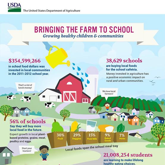
Credit: USDA Farm to School Census Infographic, Creative Commons license CC BY 2.0

Related Topics

See it in Practice

Image
Two examples of infographics.
Photo Credit

Credit: Leah Baker and Aliana Katz, used with permission

EGEE 401: Energy in a Changing World incorporates infographics as part of the assessment strategy to help students evaluate, analyze, and synthesize assigned readings. Traditionally, the course relied on weekly quizzes, which included both auto-graded and essay questions. While the automated questions alleviated some of the grading workload for the faculty, they didn’t provide an optimal representation of student comprehension. The essays provided the instructor with a stronger valuation of student learning but were time-consuming to grade.

The assessment strategy was redesigned in order to enhance students learning and retention of the material while providing a better balance to the instructor’s grading workload. Infographics encourage the students to review the course material and thoroughly evaluate the concepts presented. Students must then identify one external source, such as a journal article, and synthesize the information in the article with the course content. Students then use a graphic design program such as Adobe Express or Canva to create an infographic to be submitted for grading.

A rubric is used to communicate expectations for student success and consistency of grading across the submissions. Since infographics are a creative activity, grading could easily become subjective. The use of a rubric provides a predetermined set of criteria by which the instructor will evaluate students’ performance on the assignment: accuracy of information, clarity of communications, thoughtful reflection of the content, authenticity of content (prevents students from simply copying and pasting content from the course pages), visual design of the infographic, and proper citations of external sources.  

Considerations

Accessibility

  • To fully engage in this type of activity, learners need to be able to use a graphic design program in order to both generate graphics/content and review designs that have been created.
  • It would be beneficial to provide an alternate form of this assignment to learners with a visual impairment. Ideas might include the creation of a video advertisement or a radio spot audio recording or a text-based description of how various concepts relate to one another.
  • To allow individuals with visual impairment to participate in peer review work, consider asking all students to include a text-based description to accompany their infographics. (Text-based versions should also include proper formatting to ensure a screen reader can read the information.)
     

Other

  • Plagiarism: To encourage individual work, require students to review at least one external source (journal article or news publication) and to compare, contrast, or synthesize the information from the two sources into the creation of a meaningful and informative infographic.
  • Consistency in grading: Given the artistic and creative aspects of creating infographics, the inclusion of a grading rubric is recommended to ensure there are consistent metrics used to evaluate all submissions. See the example description for more.

Contributor(s)

Image
Example of an infographic from an internship
Photo Credit

Credit: Kate Robeson-Grubb, Used with permission

Translating the learning and personal growth that comes from various engagement experiences such as internships, exchange programs, research opportunities, and others can be difficult. An infographic is a great way to have students synthesize their experience and share the learning and growth that occurred with the world. It also provides them with an educational artifact they can share on a blog, and even in university poster exhibitions or competitions.

Please read on to see an example of an assignment used for a short-term exchange program.

Assignment Overview

As someone who has completed several different study abroad opportunities, I know there is much to share. An infographic will help you tell that story, but more importantly, it will help you reflect on and synthesize your experience.

An infographic is a way to visually represent your experience in an interesting, and clear, concise way. It should be

  • focused - one single message; emphasize its significance to you;
  • graphic - graphics and images tell the story (fewer than 800 words total);
  • ordered - the sequence should be obvious; simple flow paths and cues should guide the reader.

Consider what story you want to tell

This should include what you learned and how you grew through the experience as well as what you did. Spend significant time thinking about this and sketching out a plan. It is unlikely you will figure this out on your first try. Feel free to send me an outline or sketch. I am more than happy to provide feedback before you start creating the final product.

Choose the Layout

As you can imagine, creating an effective infographic is a bit more complicated than simply putting facts and images together. The information must also be efficiently organized to demonstrate the connections between important concepts or ideas. There are several ways in which you can organize your content. Please watch 10 Types of Infographics and When to Use Them by Easelly on YouTube.

Choose your Software

Now that you know the core elements of infographics, you may be wondering how to actually get started. There are a number of software applications that will help you quickly and easily create an infographic. Many of them also have free tutorials available on YouTube. You can start by looking at the applications listed below. Feel free to experiment and try different ones until you find one that works well for you.

Adobe Express is part of Adobe's Creative Cloud Suite. It allows you to create a variety of graphic-based resources. As a registered Penn State student, you have free access to this software.

Canva also offers free accounts. It has a simple and easy-to-use interface and each item you create is downloadable in a PDF format. *Please note: Canva offers graphics and other elements for an additional fee. You are not expected to purchase anything in order to create your infographics. Doing so is at your own discretion.

Tips for Creating an Effective Infographic

  • Present all information in a visual and concise way.
  • Cite all data and graphics.
  • Choose your fonts carefully.
    • Choose a font that is easy to read.
    • Limit font choices to 2-3 different fonts and be consistent where you use them (titles, headers, text, etc.).
    • Limit the amount of text. Each text box should contain 50 words or less.
  • Limit your color scheme to 2-3 colors and use color to:
    • connect your ideas, sections, categories, etc;.
    • highlight the most important elements;
    • direct your audience through the story;
  • Consider the size of various elements. Size helps to:
    • suggest the importance and relevance of various elements -- the bigger something is the more important it is;
    • connect ideas and sections;
    • direct your viewer through the display;

Considerations

Accessibility

Infographics can be difficult for students with visual impairments so it is important to have an alternative assignment plan in place. If you want students to review each other's infographics, students should provide a long text description of the infographic for their visually impaired peers.

Other

  • This example is specific to an internship experience but it can be modified for use in any engagement experience including, but not limited to, research, study abroad, and volunteer work.
  • There are a whole host of presentation tools available for student use.

Contributor(s)

References/Resources

  • Dunlap, J.C., & Lowenthal P.R.(2016).Getting graphic about infographics: design lessons learned from popular infographics, Journal of Visual Literacy, 35(1), 42-59. https://doi.org/10.1080/1051144X.2016.1205832

Contributor(s)