Elements added to course content to help clarify or explain concepts. Sometimes these are decorative, to make the content more visually appealing, or are used to invoke emotion.
MATSE 400: Crystal Chemistry requires students to build complex 3D models of crystals. In a traditional lab situation, the instructor walks around the room to assist the students while they build the 3D models. The video above provides the online students an opportunity to see the intricate details of the model building process.
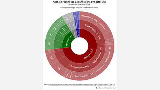
EME 801: Energy Markets, Policy, and Regulation deals with a number of complex datasets that are traditionally displayed in a tabular format. To help students visualize the data contained in the tables, Flourish was used to create interactive multi-level pie charts. Students can interact with the pie chart by clicking on the chart to see the distributions within subcategories.
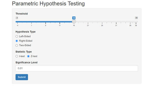
The R Shiny Parametric Hypothesis Testing tool, shown above, is used in METEO 815 to help the students understand the complicated statistical mathematics behind hypothesis formation and testing. The lesson materials provide the mathematical equations used for hypothesis testing and include a few static images to help illustrate the process.
The concept of presenting information in a visual format is not new. In fact, you may remember that ancient Egyptians used hieroglyphs as a visual form of communication. However, the use of information graphics (also referred to as infographics) in teaching and learning strategies still appears to be an emerging practice.
Everyone knows the expression, “a picture is worth a thousand words.” Consider how much more value can be added to a picture if you can interact with it. Research indicates that “Although useful, static visualizations may still fall short of being able to engage students in exploratory activities that are conducive to positive learning experiences” (Sedig et al., 2010).