This is not the front page

Using Visual Elements to Engage Students

Instance Description

Everyone knows the expression, “a picture is worth a thousand words.” Consider how much more value can be added to a picture if you can interact with it. Research indicates that “Although useful, static visualizations may still fall short of being able to engage students in exploratory activities that are conducive to positive learning experiences” (Sedig et al., 2010).

There are many online tools that can be used to offer interactive visual elements in online courses. Some allow users to create and interact with 3D models and can be used to show a variety of interactive representations of data.

There is little value in using images simply to break up large blocks of text; however, according to Priti Shah, a “benefit of visualizations is that they can be attractive and motivating. Viewers’ attention is drawn to these displays, and students will be more apt to study them for longer periods of time” (Shah, 2003). In addition, Richard Mayer’s research indicates that “offering visual elements that can be manipulated by the student may produce deeper processing because the user can select, compare, and integrate materials with their own prior knowledge” (Mayer, 2002).

The following quotation, from Sankey, et al. (2010) represents a common theme among students who were asked to discuss their feelings about the use of interactive elements in the learning environment.

I found the textbook reading the least helpful because I found it to be less fun and sort of boring. It was overwhelming with all of the text and I found that I couldn't understand it as well as I could with the interactive diagram.

See the examples below to learn about how to use visual elements to engage students.
Image
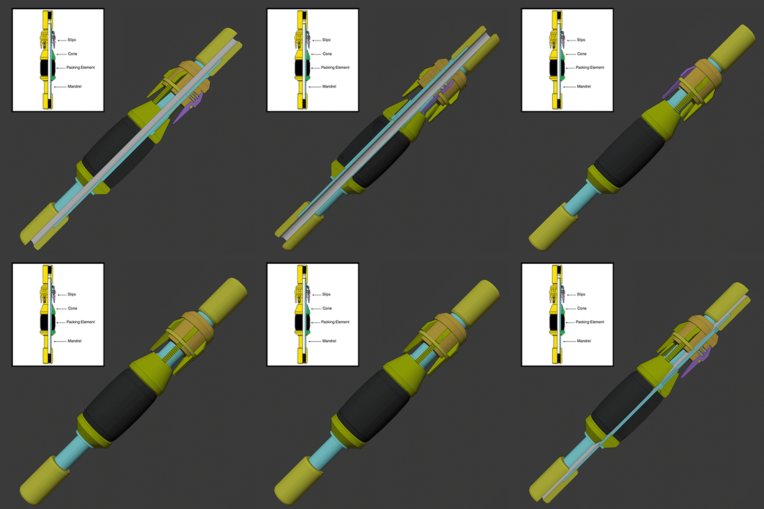
3D model of a tension packer
Photo Credit

Credit: M. Wherley. © Penn State University, is licensed under CC BY-NC-SA 4.0

Related Topics

See it in Practice

EME 801: Energy Markets, Policy, and Regulation deals with a number of complex datasets that are traditionally displayed in a tabular format. To help students visualize the data contained in the tables, Flourish was used to create interactive multi-level pie charts. Students can interact with the pie chart by clicking on the chart to see the distributions within subcategories.

Flourish offers a number of data visualization options including graphs, flow charts, bar charts, timelines, and maps. Most of the options are interactive and can be animated to show changes over time.

Considerations

Accessibility

The Flourish site provides a chart that defines the accessibility of specific types of charts and features.
 

Other

Additional information can be found on the flourish.studio website along with a gallery of interactive examples.

Contributor(s)

The R Shiny Parametric Hypothesis Testing tool, shown above, is used in METEO 815 to help the students understand the complicated statistical mathematics behind hypothesis formation and testing. The lesson materials provide the mathematical equations used for hypothesis testing and include a few static images to help illustrate the process. The use of the R Shiny tool takes the lesson to another level by providing students the ability to manipulate several different parameters involved in the hypothesis test and to visualize how those parameters affect the decision to accept or reject a null hypothesis.


The R Shiny Number of Samples tool, shown above, is used in METEO 815 to help students visualize the relationship of basic statistical concepts like sample size, frequency, range, and mean. The student can adjust the number of samples used to create the histogram. The students should notice that as the number of samples increases, the mean estimate moves closer to the true mean. The students should also see that as the sample size increases, the range estimate is more likely to increase because, as we sample more, we increase the likelihood of sampling the extreme part of the population (the tails of the frequency histogram).

Considerations

Accessbility

  • When designing R Shiny apps, make sure they meet accessibility requirements.
     

Other

Contributor(s)


Percent Oil Production Relative to OPEC Quota
  Algeria Indonesia Iran Libya Nigeria Qatar Saudi Arabia UAE Venezuela
1982 Jan 53 -3 110 67 -8 0 -21 18 27
1982 Mar 49 0 81 50 -5 6 -15 15 22
1982 Jun 46 3 52 34 -2 11 -10 12 17
1982 Sep 42 6 24 18 1 16 -4 9 12
1983 Jan 39 10 -5 2 4 21 1 6 7
1983 Mar 41 10 -5 2 6 19 0 10 8
1983 Jun 43 11 -5 3 8 17 -2 15 8
1983 Sep 45 12 -5 4 10 15 -4 19 9
1984 Jan 46 13 -5 4 12 14 -5 23 10
1984 Mar 48 13 -5 5 14 12 -7 28 10
1984 Jun 50 14 -5 5 15 10 -8 32 11
1984 Sep 50 14 -5 5 15 10 -8 32 11
1985 Jan 50 14 -6 5 15 9 -8 32 11
1985 Mar 49 14 -6 5 15 8 -8 32 11
1985 Jun 49 14 -6 5 15 7 -7 32 11
1985 Sep 49 14 -6 5 15 7 -7 32 10
1986 Jan 49 14 -7 5 15 6 -7 32 10
1986 Mar 48 14 -7 5 15 5 -7 32 10
1986 Jun 48 13 -7 5 15 4 -6 32 10
1986 Sep 59 16 6 -4 4 2 -1 35 16
1987 Jan 61 16 0 -1 6 -25 2 62 15
1987 Mar 63 16 -6 3 8 -53 4 88 13
1987 Jun 59 14 -5 10 10 -18 9 75 16
1987 Sep 56 13 -5 18 12 17 13 62 19
1988 Jan 56 13 -2 16 13 16 13 63 18
1988 Mar 56 13 0 13 15 15 13 65 18
1988 Jun 56 13 3 11 17 14 13 67 16
1988 Sep 56 13 6 9 19 13 13 69 16
1989 Jan 53 10 -47 7 23 16 8 74 13
1989 Mar 50 7 -99 6 27 19 3 78 10
1989 Jun 43 4 -3 3 20 12 8 95 8
1989 Sep 40 1 -5 4 8 7 5 90 4
1990 Jan 43 8 -1 13 13 8 22 70 11
1990 Mar 46 14 3 21 18 9 38 50 17
1990 Jun 47 13 3 15 13 7 25 34 13
1990 Sep 48 12 3 9 8 5 12 18 9
1991 Jan 49 12 3 3 3 3 -2 2 5
1991 Mar 53 12 4 2 6 1 0 3 6
1991 Jun 56 13 5 1 9 0 1 4 6
1991 Sep 60 14 6 6 12 -1 3 4 6
1992 Jan 60 14 6 5 12 4 3 4 6
1992 Mar 59 14 6 4 13 9 2 3 5
1992 Jun 59 14 6 4 13 13 2 2 4
1992 Sep 58 13 6 3 14 18 1 1 4
1993 Jan 63 16 9 0 12 14 3 2 9
1993 Mar 61 15 6 0 9 15 3 2 11
1993 Jun 60 13 3 -1 6 16 3 3 13
1993 Sep 60 14 3 0 7 20 3 3 15
1994 Jan 61 14 3 0 8 23 3 3 17
1994 Mar 62 14 3 0 9 27 3 4 19
1994 Jun 63 14 3 1 11 31 3 4 21
1994 Sep 64 14 3 1 12 35 4 5 23
1995 Jan 65 15 3 1 13 38 4 5 25
1995 Mar 66 15 3 1 14 42 4 5 27
1995 Jun 67 15 3 2 16 46 4 6 29
1995 Sep 67 15 3 2 17 50 5 6 31
1996 Jan 68 15 3 2 18 53 5 7 33
1996 Mar 69 15 3 3 19 57 5 7 35
1996 Jun 65 14 1 2 18 60 5 6 35
1996 Sep 60 12 -1 1 17 62 4 5 35
1997 Jan 56 10 -3 0 16 65 4 4 34
1997 Mar 51 9 -4 -1 15 68 4 3 34
1997 Jun 47 7 -6 -2 13 70 4 2 34
1997 Sep 42 5 -8 -3 12 73 3 1 33
1998 Jan 55 19 10 4 1 2 2 7 6
1998 Mar 46 10 1 -4 16 86 1 8 38
1998 Jun 52 14 3 0 15 62 2 8 26
1998 Sep 57 18 6 4 13 37 3 8 14
1999 Jan 63 22 8 8 12 13 4 8 3
1999 Mar 61 19 8 7 36 13 4 9 2
1999 Jun 60 17 9 7 59 13 3 9 1
1999 Sep 59 14 9 7 82 12 2 10 2
2000 Jan 57 12 9 6 106 12 1 10 1
2000 Mar 56 10 -63 5 96 13 3 6 3
2000 Jun 50 3 -3 1 3 10 3 4 -3
2000 Sep 55 9 3 4 10 15 4 9 6
2001 Jan 63 9 0 6 10 16 4 10 4
2001 Mar 65 10 3 6 16 15 4 8 4
2001 Jun 67 12 5 6 23 15 4 6 4
2001 Sep 86 13 8 13 21 21 8 10 5
2002 Jan 76 7 -10 13 19 21 10 8 -15
2002 Mar 67 2 -28 13 17 21 12 7 -36
2002 Jun 57 -4 -46 12 15 22 13 6 -56
2002 Sep 47 -9 -62 12 13 22 15 4 -76
2003 Jan 38 -16 1 7 -3 17 15 4 -33

The primary purpose for implementing Highcharts in EME 801: Energy Markets, Policy, and Regulation was to help students extract pertinent information presented in the oil production chart shown above. The interactive chart allows the user to use their mouse to hover over the chart to extract specific information about the oil output for each of the nine different OPEC countries. The user can also click on the country names in the legend to hide or reveal the data for individual countries. Clicking on the link below the chart will reveal the tabular data used to generate the output shown in the line chart.

Highcharts can output multiple chart formats including pie charts, line charts, column/bar charts, scatter charts, bubble charts, gauges, maps, heat maps, word clouds, timelines, Venn diagrams, Euler diagrams, stock charts, histograms, network graphs, and more.

Considerations

Accessibility

  • Many, but not all, Highcharts styles are accessible.
  • Highcharts has several charts specifically designed to accommodate various accessibility issues, including charts that utilize sound (sonification).
     

Other

  • Highcharts is not currently working in Canvas.
  • Highcharts can host your charts if you are not able to.
  • No plugins are needed.

Contributor(s)

Figure 1.1a: 3D interactive view of 2-hydroxyethyl methacrylate.
This is the root segment of the polymer shown above that is used to make contact lenses.
(Use your mouse to manipulate the interactive molecular diagram.)
Source: MolView

Typical molecular diagrams try to represent molecules in two dimensions. Students in MATSE 202: Introduction to Polymer Materials need to understand how the structure of molecules affects the production of polymers. MolView allows the students to interact with a 3D representation of the molecule to view the structure from any angle. This interactivity can promote interest and motivation on the part of the student, leading to a more careful study of the structure. 

Molview can be added easily to any course where students can benefit from a three-dimensional understanding of molecular structures. Students can use Molview to build molecular structures from scratch, and Molview has an extensive database of predefined standard molecular models.

Considerations

Accessibility
Molview may not be accessible for the non-sighted user. The non-sighted user should be given access to a traditional 3D molecular model kit.

Other
Molview can be embedded in Canvas pages and in Canvas quiz questions.

Contributor(s)

References/Resources

  • Liang, H., & Sedig, K. (2010). Can interactive visualization tools engage and support pre-university students in exploring non-trivial mathematical concepts? Computers & Education, 54(4), 972-991. https://doi:10.1016/j.compedu.2009.10.001
  • Mayer, R. E. (2002). Cognitive theory and the design of multimedia instruction: An example of the two-way street between cognition and instruction. New Directions for Teaching and Learning, 2002(89), 55-71.
  • M. Sankey, D. Birch, & M. Gardiner, “Engaging students through multimodal learning environments: The journey continues.” in Proceedings of the 27th Australasian Society for Computers in Learning in Tertiary Education, C.H. Steel, M.J. Keppell, P. Gerbic & S. Housego, Eds., Sydney, Australia, Dec. 2010, pp.852-863.
  • Shah, P., & Freedman, E. G. (2003). Visuospatial cognition in electronic learning. Journal of Educational Computing Research, 29(3), 315-324. https://doi:10.2190/QYVJ-Q59L-VE7C-EHUV

Contributor(s)